In the world of branding and marketing, the importance of a clean and modern design cannot be stressed enough. It helps convey professionalism while establishing a strong brand identity. One effective design approach is the use of minimalist ribbons adorned with symbols or icons. This guide will explore the significance of such designs, provide practical tips for incorporating symbols or icons into ribbon designs, and demonstrate the impact of minimalist ribbon designs on brand recognition and consumer perception.
#1 The Power of Clean and Modern Design:
- Conveying Professionalism: By opting for a minimalist ribbon design, small businesses and marketing professionals can present themselves as sophisticated and contemporary.
- Establishing Brand Identity: Minimalism simplifies the design, allowing the symbol or icon to become the focal point, making the ribbon versatile and easily recognizable, and becomes a status symbol. Memorable and Emotes feelings and creates an experience.
#2 Successful Examples of Minimalist Ribbon Designs:
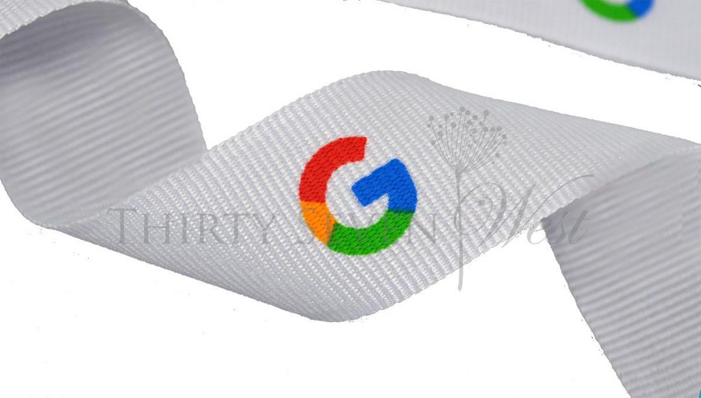
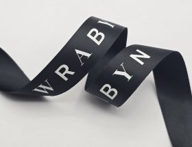
- Logo Variation: A minimalist ribbon can include a logo that embodies the brand’s essence without relying on a name or monogram. (Google Picture, )
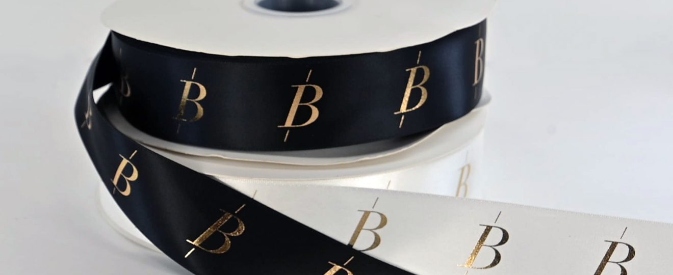
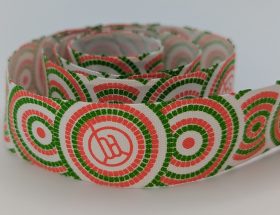
- Icon/Symbol Variation: Another approach is to use a powerful symbol or icon as the centerpiece of the ribbon design.

#3 The Significance of Simplicity:
- Creating Memorability: Simple designs are more likely to be remembered and recognized by consumers. Thick about the couture names you know, they are simple fonts and the names are very simple.
- Timelessness: Simplicity ensures that the ribbon design remains relevant and effective even as design trends evolve.
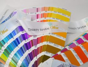
In Lindaology 🙂 (Linda, the owner of the company), the reason that that is across the board is because when you see a simple name your mind takes a picture of it and makes an impression on your memory. Now why did we do 1 simple font and 1 cursive font, because we do simplistic and we do elaborate designs in custom logo ribbons. I know I gave up the memorability for the dual purpose of the company to cater to the simplicity and creativity. We have noticed that as expected people remember the Thirty Seven, and we have to remind them that the name is Thirty Seven West, because the West is in cursive 🙂
#4. Tips for Selecting and Incorporating Symbols/Icons:
- Relevance and Representation: Choose a symbol or icon that aligns with the brand’s values, products, or services.
- Versatility: Consider the scalability of the symbol or icon to ensure it remains recognizable at various sizes.
- Integration: Seamlessly incorporate the symbol or icon into the ribbon design, allowing it to be the focal point while maintaining harmony.
#5. Considering Color, Proportion, and Negative Space:
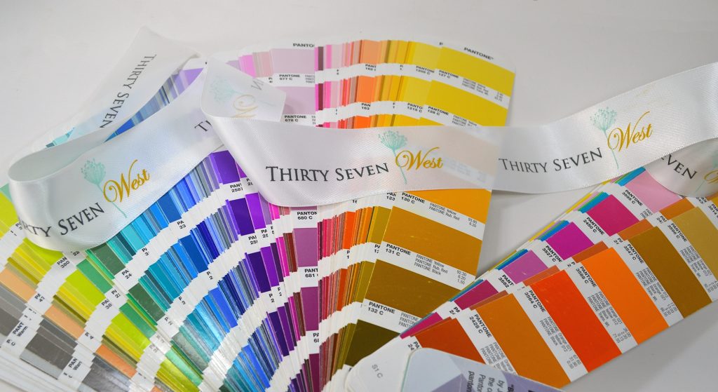
- Color Choice: Select colors that align with the brand’s identity and evoke the desired emotions.
- Proportion: Ensure the symbol or icon is proportionate to the ribbon, creating a well-balanced composition.
- Negative Space: Leverage negative space to enhance the overall aesthetic and draw attention to the symbol or icon.
#6. Impact and Case Studies:
- Brand Recognition: Showcase how minimalist ribbon designs have helped small businesses gain brand recognition in competitive markets.
- Consumer Perception: Discuss how consumers perceive brands with minimalist ribbon designs as more professional, memorable, and trustworthy.
![]() Conclusion: Minimalist ribbons with symbols or icons offer small businesses and marketing professionals a powerful tool to convey professionalism and establish a strong brand identity. By following the tips provided, including selecting the right symbol or icon, incorporating it effectively, and considering color, proportion, and negative space, readers can create impactful ribbons that elevate their brand image and effectively communicate their message. The case studies presented highlight the real-world impact of minimalist ribbon designs on brand recognition and consumer perception.
Conclusion: Minimalist ribbons with symbols or icons offer small businesses and marketing professionals a powerful tool to convey professionalism and establish a strong brand identity. By following the tips provided, including selecting the right symbol or icon, incorporating it effectively, and considering color, proportion, and negative space, readers can create impactful ribbons that elevate their brand image and effectively communicate their message. The case studies presented highlight the real-world impact of minimalist ribbon designs on brand recognition and consumer perception.
