Incorporating Pantone Matching Ribbon into your design projects can greatly enhance the overall aesthetic and ensure a cohesive and professional finish. This blog post will provide you with practical tips on how to seamlessly incorporate Pantone Matching Ribbon into your designs, ensuring perfect color matches, appropriate application methods, attention to finishing details, and overall integration with your project’s color scheme and design elements.
 Understanding the Significance of Color Matching:
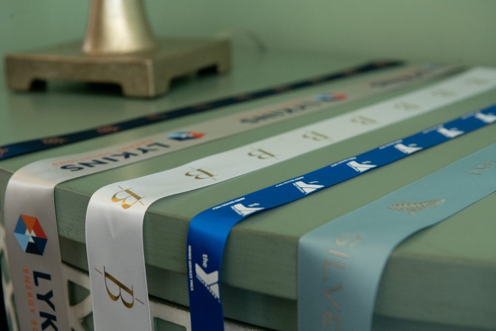
When working with Pantone Matching Ribbon, it is crucial to understand the significance of color matching. The Pantone Matching System (PMS) is a standardized color reproduction system that allows for accurate color communication. To ensure perfect color matches, always refer to the Pantone Color Guide when selecting Pantone Matching Ribbon. This will help maintain consistency and precision in your design.
Choosing the Right Application Method:
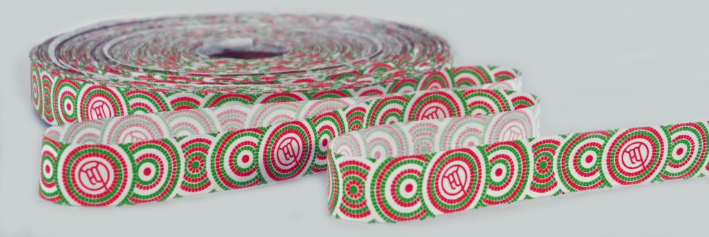
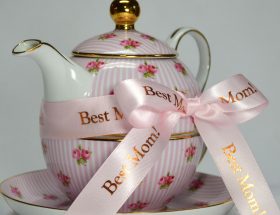
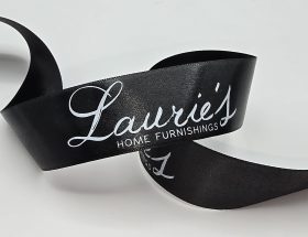
Consider the best application method for incorporating Pantone Matching Ribbon into your project. Whether it’s a gift wrapping project, a corporate event, or product packaging, selecting the appropriate ribbon thickness, texture, and material is essential to complement your overall design concept. For a sleek and sophisticated look, a satin ribbon might work well, while a grosgrain ribbon could add texture and visual interest, and cotton ribbon would work well for an eco friendly presentation.
 Paying Attention to Finishing Details:
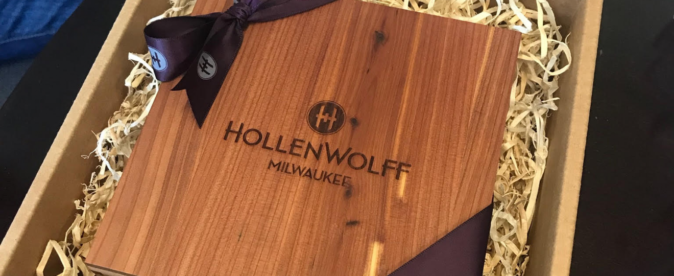
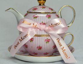
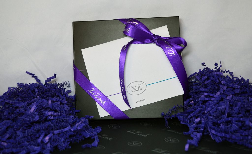
To achieve a polished final result, pay attention to the finishing details when working with Pantone Matching Ribbon. Properly align and secure the ribbon by tying it into a knot or bow, using adhesive, sewing techniques, or other fastening methods. Ensure that the ribbon is neatly applied and securely attached to create a professional finish.
Considering the Overall Color Scheme and Design Elements:
When incorporating Pantone Matching Ribbon, it is important to consider the overall color scheme and design elements of your project. The ribbon should seamlessly integrate into the theme and enhance the visual appeal. Experiment with different combinations and seek inspiration from Pantone color trends and palettes to create unique and eye-catching designs.
Conclusion:
By following these practical tips, you can effectively incorporate Pantone Matching Ribbon into your design projects, adding a touch of professionalism and elegance. Remember to prioritize color matching, choose the appropriate application method, pay attention to finishing details, and consider the overall color scheme and design elements. With these considerations in mind, you can create visually appealing designs that stand out and leave a lasting impression.
