 What is the Pantone Matching System?
It is a great tool to identify your intentions.
All
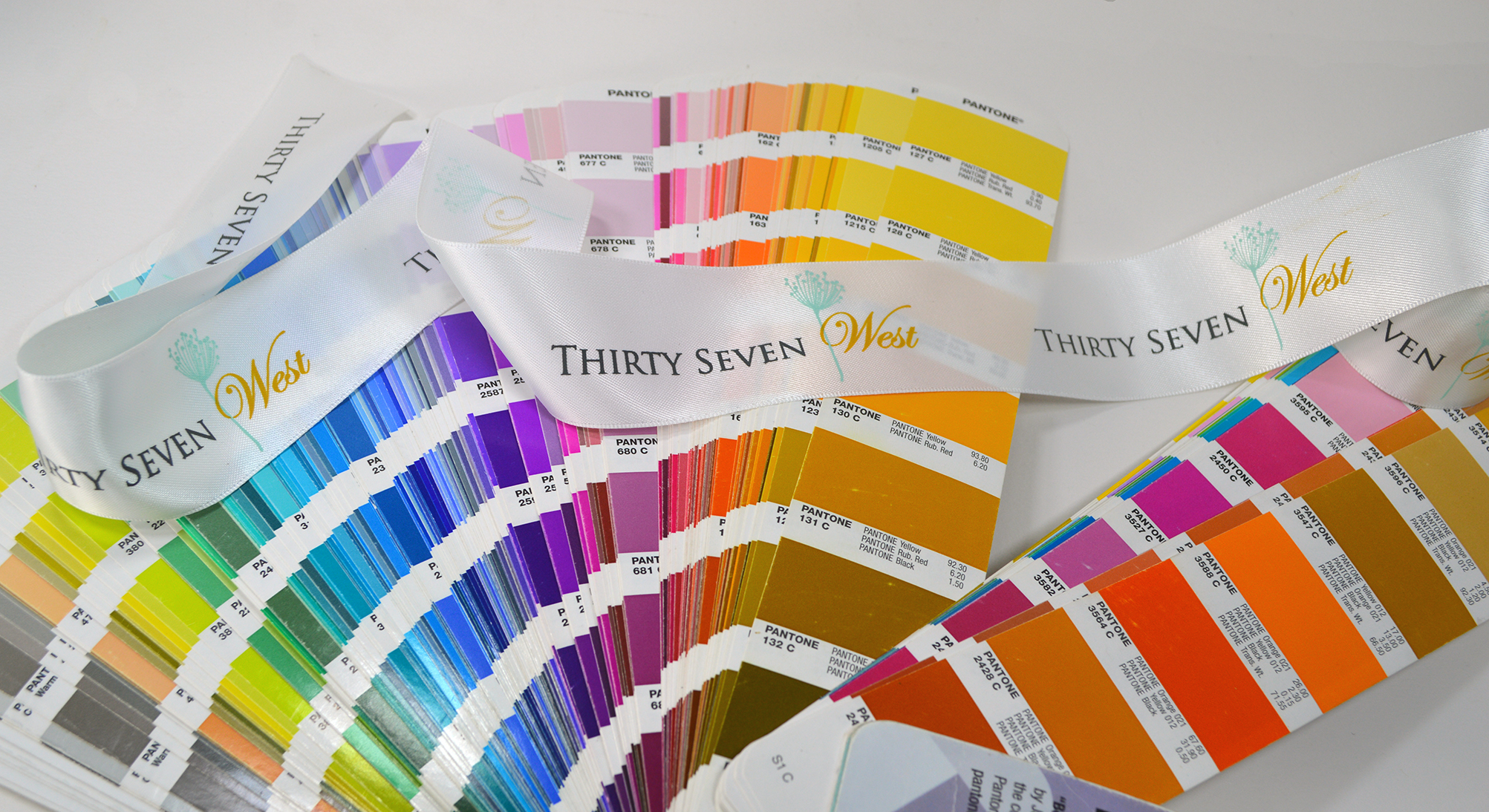
The Pantone Matching System (PMS) is a standardized color reproduction system that was developed by Lawrence Herbert in the late 1950s. This system is mainly used in the printing industry, but it has also found use in the manufacture of fabrics, paint, and plastics. The Pantone Matching System has become the most widely used system among graphic professionals such as designers and graphic artists, as well as in various printing industries.
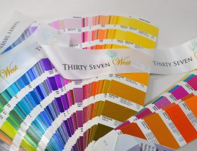
The Pantone Matching System ensures that manufacturers and printers anywhere in the world can get a definite concept of what a specific color should look like, simply by referring to the code assigned and the swatch guide. There are various color guides that are used for this purpose: The Formula Guide, which displays 18 basic Pantone mixing colors and a palette of color variations created using the base inks in different proportions, and the CMYK Guide, which shows over 2,800 CMYK process colors and their values.
This guide is to be used when printing, using the four-color process printing. It was designed to work with any type of equipment used to reproduce colors and can also be used to reproduce color effects such as metallic and fluorescent tones. In this system, the colors are represented using a 3- or 4-digit code followed by a letter which represents the type of paper stock the color is printed on: Uncoated, Coated, and Matte.
In the Pantone Matching System, each Pantone color corresponds to a number and swatch sample that is created mixing 13 base pigments in specific amounts; this protects consistency and guarantees reproducibility. The artist or designer just needs to provide the Pantone color codes used in their work for the printing company to be able to reproduce them. Using this system ensures that the right color is printed, regardless of what it may look like on the screen.
This system can be used to match colors when you can’t compare the samples in person. It is the best choice when you need to get a good idea of what a client is looking for when reproducing logos in multiple media; create precise shades and lively hues; add special effects such as fluorescent details or pastel color; or when you need to cover a large area where color consistency is extremely important.
As an example, we used an Internet matching application to find the Pantone number to the closest match for the colors of our logo.
