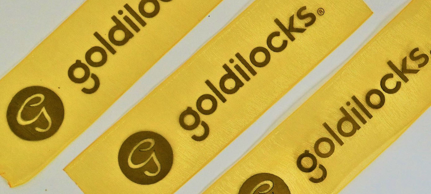
Creating an effective logo ribbon is a crucial aspect of brand identity that can enhance the visual appeal and recognition of your logo. A well-designed logo ribbon should seamlessly integrate with the overall design, adding a layer of sophistication and professionalism. In this blog post, we’ll explore the key elements and best practices for designing a logo ribbon that stands out and strengthens your brand’s market presence.
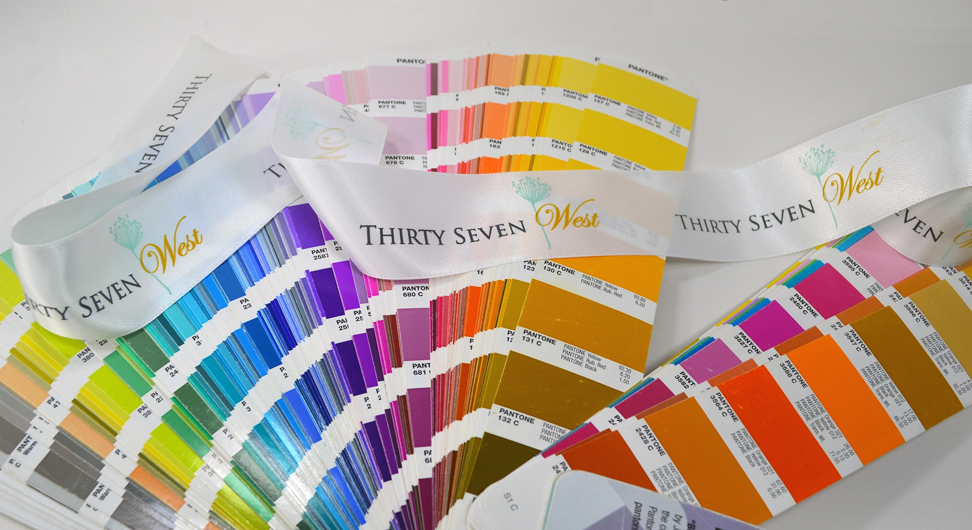
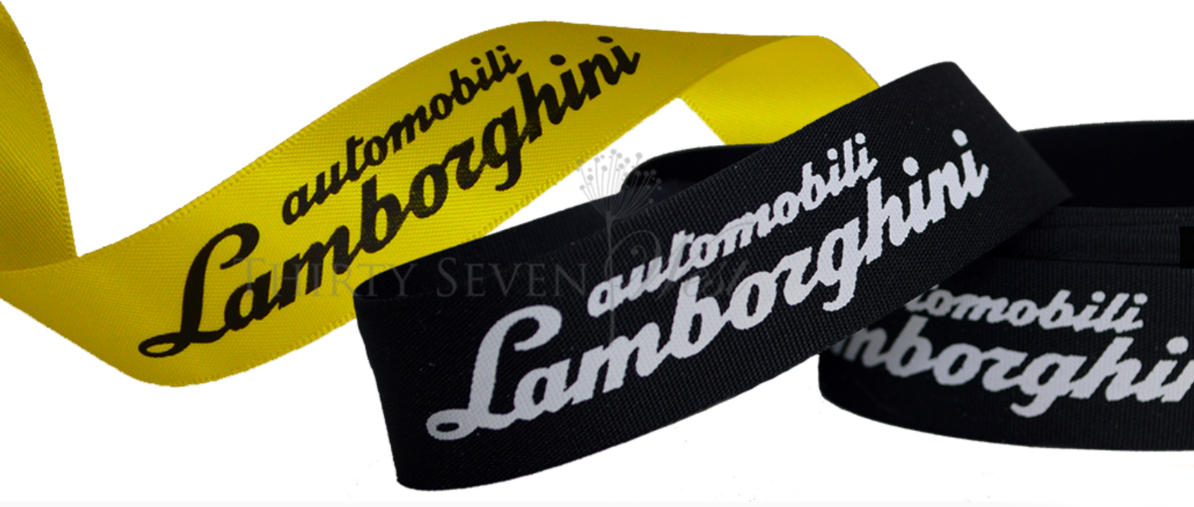
Start by selecting a color palette that complements your brand’s primary colors, ensuring that the ribbon does not overshadow the main logo but rather accentuates it. The colors chosen should harmonize with your existing brand colors, creating a cohesive and visually appealing look. Avoid using too many colors, as this can make the design look cluttered and distracting.
Shape and Style Alignment
The shape and style of the ribbon should align with the brand’s ethos—whether it’s modern, classic, playful, or elegant. For instance, a modern brand might opt for a sleek, minimalistic ribbon, while a classic brand might choose a more ornate, traditional design. The ribbon should reflect the overall personality of the brand, adding to its identity rather than detracting from it.
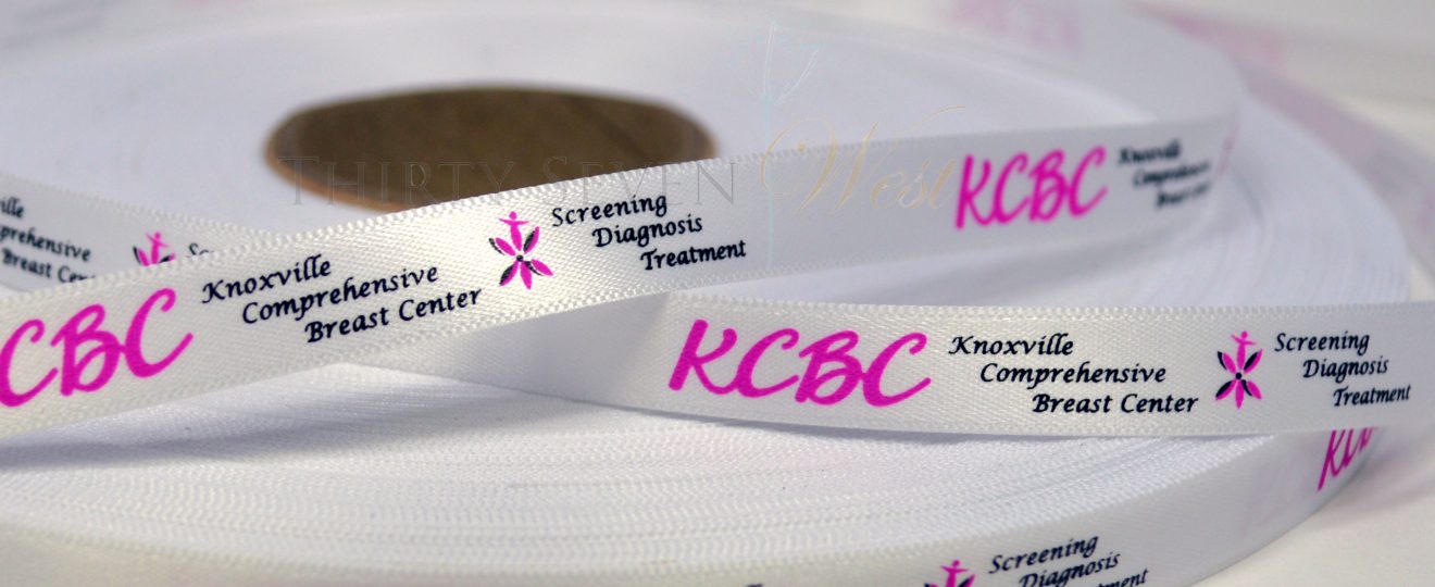
Typography within the ribbon is equally important; choose fonts that are legible and reflect the brand’s personality. The font should be easy to read at different sizes and should match the tone of the brand. For example, a playful brand might use a whimsical font, while a professional brand might opt for a more traditional, serif typeface.
Placement and Size Considerations
Consider the placement and size of the ribbon to maintain balance and harmony within the logo design. The ribbon should not dominate the logo but should complement it. Proper placement ensures that the ribbon enhances the overall design without overwhelming the main elements of the logo.
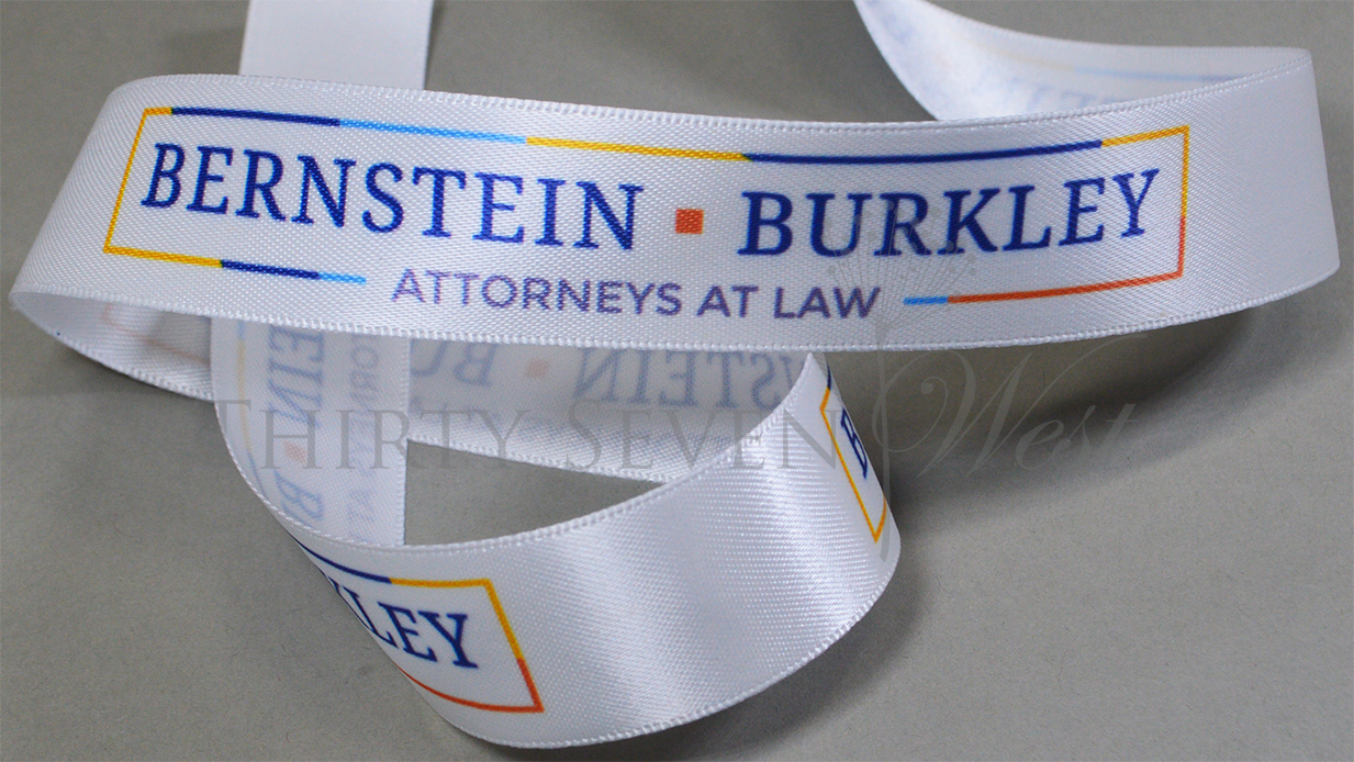 Incorporating Textures and Gradients
Incorporating subtle textures or gradients can add depth and dimension, making the ribbon more visually appealing. These elements should be used sparingly to avoid clutter. Textures and gradients can give the ribbon a more dynamic and engaging look, helping it stand out in various contexts.
Testing Across Mediums and Sizes
Finally, test the logo ribbon across various mediums and sizes to ensure it remains effective and recognizable in different contexts, from business cards to digital platforms. A well-designed ribbon should look great whether it’s printed on a small business card or displayed on a large digital screen. Testing ensures that the ribbon maintains its integrity and appeal across different applications.
By focusing on these key elements, you can design a logo ribbon that not only enhances your brand’s aesthetic but also strengthens its market presence. A thoughtfully designed ribbon adds a touch of sophistication and professionalism, making your logo more memorable and impactful. With careful attention to color, shape, typography, placement, texture, and testing, your logo ribbon can become a powerful tool in your brand’s visual identity.
